With the rapidly evolving industry of web development it is essential to understand the ways in which the Web is advancing in order to ensure continued relevance for your website. With this in mind, here is the first of two important web trends for this year.
WEB TREND ONE: Mobile & Responsive Design
With the increased use of mobile devices in our society the importance of a mobile-specific web strategy is becoming highly amplified. Below are some considerations for an effective mobile website strategy.
TIn Greater Vancouver mobile website traffic is approximately
10% for business websites and 19% for consumer websites*
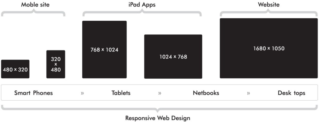
Responsive Web Design enables websites to fit into virtually any device browser, including smartphones, tablets, computer monitors, televisions and other future devices. Responsive websites not only cater to various browser sizes but can also provide additional information to the page such as supporting text and images when the browser window is enlarged. Web industry experts currently recommend that you strongly consider a responsive website approach.

Mobile Detect is an alternative to responsive design whereby your site will auto-detect the viewing device’s profile and resize the website accordingly. Typically programmed for Apple and Android smartphones, this less expensive alternative does not cover the complete range of potential screen sizes.
Content Management Systems (CMS) will often deliver mobile capability through modules or plugins. WPTouch for WordPress is a common browser/device detect-style plugin option while responsive modules are common for Drupal and Sitefinity CMS solutions.
Web Apps are effective for use with complex websites and applications such as Facebook and other Social Media platforms. The major challenge with web apps is the need to often develop separate versions for each operating system.
*Source: Representative average of Graphically Speaking clients’ website traffic, January 2013.