We here at Graphically Speaking can’t believe another year has come and gone. 2013 has been an exciting year and we look forward to what 2014 will bring. As New Year’s approaches, we’d like to take some time to reflect on eight exciting projects from this past year. Every example showcases unique design and programming features as well as mobile and responsive design.

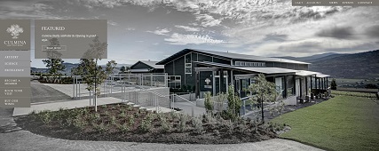
From first glance you can tell this WordPress site is design-focused. We worked together with the client to achieve a bold and unique site, based around client-provided photography and the company’s three pillars: artistry, science and excellence. The sweeping landscapes are beautifully captured in unique, long scrolling pages on the Artistry, Science and Excellence overview pages. Working with third-party providers we helped to set up their ecommerce store and their wine tour and tasting bookings, making this site a comprehensive tool for their family business.

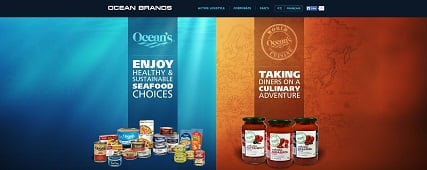
The Ocean Brands’ website is a Sitefinity site, designed to promote Ocean’s two product lines. The final outcome is a high-design site that feels like two websites expertly blended into one. The homepage showcases the two product lines and the internal pages are separated by tabs so that users can switch between the lines with ease. Each product overview page has hover animation which is visually stimulating as well as informational. And the individual product landing pages have custom built banners featuring gorgeous landscapes and product shots as well as a specially designed recipes’ section which promotes user engagement.

The Credential website was done on Sitefinity and was designed to match their previously launched site, Credential Direct, also designed by Graphically Speaking. The three editable call-to-action buttons include a rotating “Our Partners” logo, a pop-up that plays a Credential YouTube video, and randomized client testimonials. For visual stimulation we programmed rotating banners on the home page, image mouse-overs on their mission page, and a carousel of partner logos.

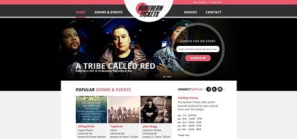
One of the most important requirements for this WordPress site was to promote usability. It was important for users to be able to find the information about shows and venues as quickly as possible, which is why we incorporated a search function on the home page, as well as a more advanced search on the actual events page. Once you click on an event, the header provides dates, times and a Buy Tickets button. We also custom designed the List of Venues page and provided a click-through option that allows users to find out more about the particular venue in question, as well as other events being held there.
Check back next week for our final four websites!