The world of interactive web design is extremely fluid and constantly changing, just like the industry it lives in. What’s considered “good design” fluctuates from year to year to keep up with changing technologies and user expectations.
The following are design trends we expect to see growing in 2014. These trends are based on our own personal observations and experience within the industry.
Mobile First

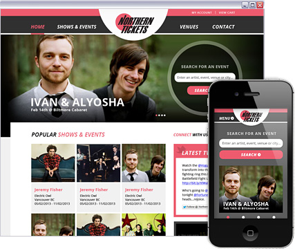
With the increase in smartphone and mobile usage in recent years, it is no surprise that designers are beginning to design with mobile in mind. Mobile has overtaken desktop traffic for many websites. This has forced designers to rethink the user experience for a variety of screen sizes and has rewarded organizations that have embraced a ‘mobile-first’ mentality.
While the reality is that many firms will still treat mobile as an afterthought, we definitely expect to see the more agile companies using mobile to drive innovative designs.
A Focus on Typography
One of the major issues with websites and applications viewed via smartphones and tablets is the difficulty of reading text. To help solve this problem, we predict web designers will begin experimenting more with typography in their interactive designs. Size, location, and layout of type-based content will play a much larger role in 2014.
The flat design trend, made popular by Windows 8 and IOS7 is just one example of a new take on typography and its relation to web design. We expect to see custom fonts, mix and match fonts, and responsive typography all playing an increasing role in the user experience
Minimalist Navigation
Minimalist navigation is a trend that we’ve seen increasing in popularity. Partly due to the need for stripped down navigation on mobile, the condensed navigation has become increasingly appealing for all screen sizes. To accommodate the simpler navigation we are seeing more focus on icons, roll downs and navigation that shrink as you start to scroll down the page.
Making the Most of One Page

Loading new pages may be a thing of the past with the growing attractiveness of layered, single pages. Instead of designing multiple pages, web designers will likely focus on lightboxes, overlays, and moving tiles that can all reduce the amount of clicks in an average user journey.
Bigger, Better Imagery

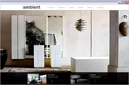
Bigger really is better with this trend. Massive pictures and backgrounds are replacing patterned textures and they certainly look great on retina displays! We expect to see more high impact visuals being used to make an impression in 2014.
Long Scrolling Sites

This trend is one we saw several years ago. Back then it was common to have a long scrolling site that was slammed with an excessive amount of content. It was cool in theory but made it pretty unrealistic from a user experience perspective. The re-vamped trend we are seeing for 2014 has organized content in a much easier to digest format. A changing layout throughout the long scrolling site provides designers with a lot of creative flexibility and can create a very unique look and feel.
Simple Colour Schemes

A design post wouldn’t be complete without a trend about colour. Simple, monochromatic color schemes will be all the rage in 2014 and by simple, we mean only one or two colours. We’ve seen this trend come in conjunction with the flat design trend, but it is not necessarily limited to this design style. Black, white, and everything in between can be used for this trend to create drama and impact. Hits of an accent color can also garnish attention when used in the right way.
Large Hero Areas Quickly Killing Sliders
If you asked us what the #1 design trend for 2014 was, this would be it!
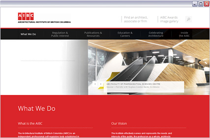
Large Intro areas, often with an image and a small amount of text, at the top of a website are popping up everywhere and it is a trend that we don’t see going away anytime soon. These large “Hero Areas” are quickly replacing traditional sliders on homepages.
Whether it is a simple blurred image in the background or a more elaborate illustration, hero areas are the new attention-grabbers providing a lot of fun and creativity for web designers.